
bondu
Bringing clarity and confidence to a new kind of play.
bondu is an AI-powered plush companion for children. I redesigned its complete e-commerce website around the parent’s purchase decision: understand what it does, explore control and safety information, then choose a companion. The challenge was to make an unfamiliar product understandable while retaining its playful character.
- My contribution
- Information hierarchy, UX/UI and visual design across the complete e-commerce website.
- Design scope
- Complete e-commerce website design across desktop and mobile. This case study features the homepage, Trust Center and product detail page as selected examples.
The live shop has since been updated. This case study documents my original redesign.
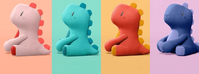

The starting point
E-commerce redesign
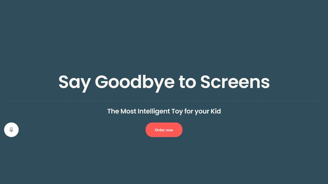
The original homepage opened with ‘Say Goodbye to Screens’. That introduced a benefit, but left the product category and how children would use it to the sections below. In the Trust Center, key family-protection explanations were placed behind collapsed accordions.
These visible differences in the original design frame the redesign. For a toy that uses AI, I prioritized explaining the experience and making the brand’s information about parental control, safeguards and privacy easier to inspect before the purchase step. The design needed to speak to parents making the decision while retaining the appeal of play for children.
Making the product understandable
E-commerce redesign
I changed the opening from a broad screen-free promise to a direct introduction: an AI companion designed for children, shown in use. Naming the category and pairing it with a real play situation gives parents an immediate starting point for understanding the offer.
The sections below explain the companion and parent app together. App features sit beside their explanations, connecting the physical toy with parental visibility. I then separated benefits for children and parents: imagination and play on one side, the family’s everyday use and oversight on the other.
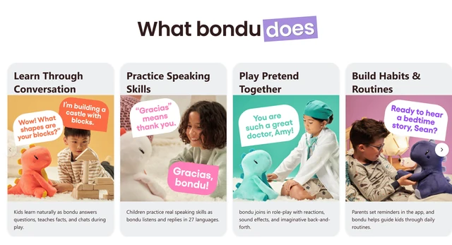
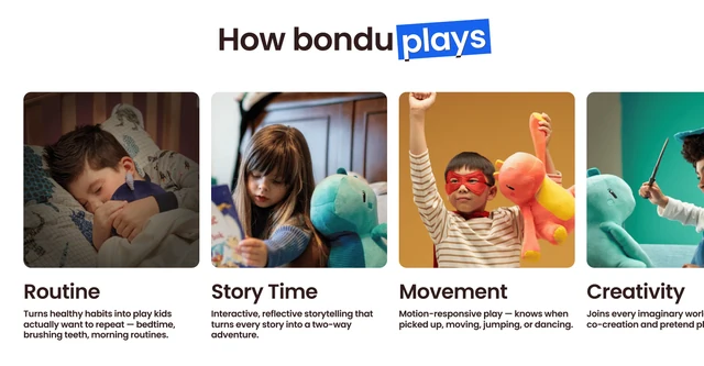
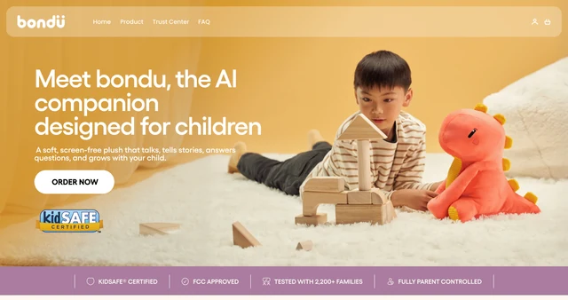
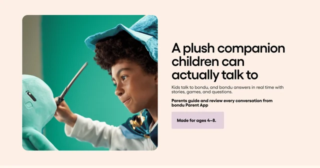
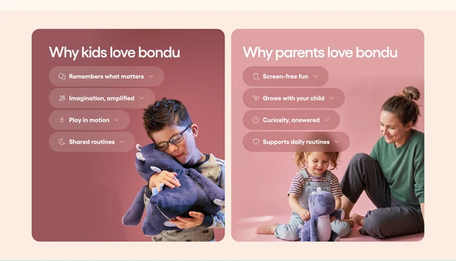
Selected homepage sections: the opening, product explanation and benefits for children and parents.
- From a promise to an explanation
- The original opening led with ‘Say Goodbye to Screens’. The redesign names the AI companion and shows a child using it, putting the product category and experience first.
- Two audiences, distinct benefits
- Children experience the play, while parents make the purchase decision. Separate sections make room for both perspectives, supported by an explanation of the parent app.
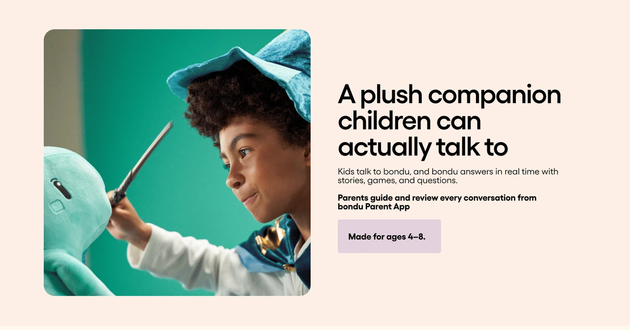
A direct product explanation connects conversation and play with the role of the parent app.
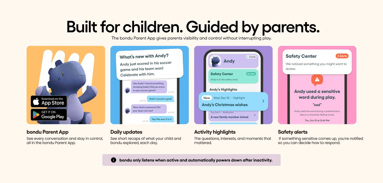
App features are presented with their explanations, making parental visibility part of the product story.
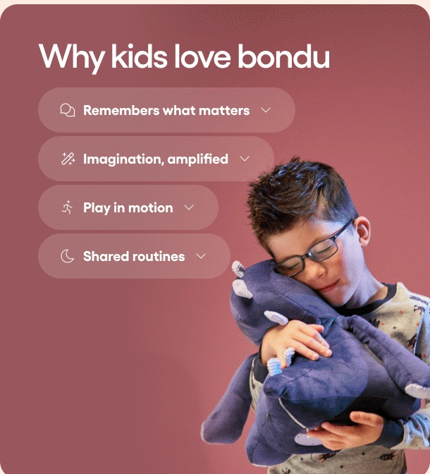
The child’s perspective: imagination, play and shared routines.

The parent’s perspective: screen-free play, development and everyday family life.

Making trust visible
E-commerce redesign
I placed a trust introduction near the beginning of the homepage, with a direct route to the Trust Center. Parents should be able to examine control and safety information while forming their understanding of the product, rather than encounter it only after the sales story.
In the Trust Center, I made key explanations visible in dedicated sections and cards. Parental visibility, conversation safeguards and privacy each receive their own heading and supporting detail. This trades a more compact accordion layout for a longer, more scannable page with answers visible before interaction.
The design presents the brand’s stated safeguards and certification information. The aim was to make those details easier to inspect, using specific explanations to support the visual sense of reassurance.
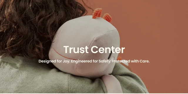


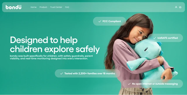
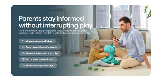
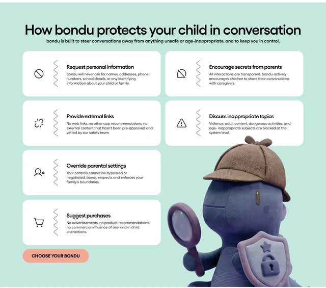
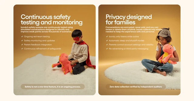
Selected Trust Center sections: the opening, parental visibility, conversation safeguards and privacy.
- Answers visible before interaction
- The original page placed key explanations behind collapsed accordions. Dedicated sections and cards bring the main points into the reading flow.
- Control, safeguards and privacy
- These topics receive separate headings and explanations. Parents can scan the brand’s stated approach without having to infer it from a general safety promise.

Supporting the purchase decision
E-commerce redesign
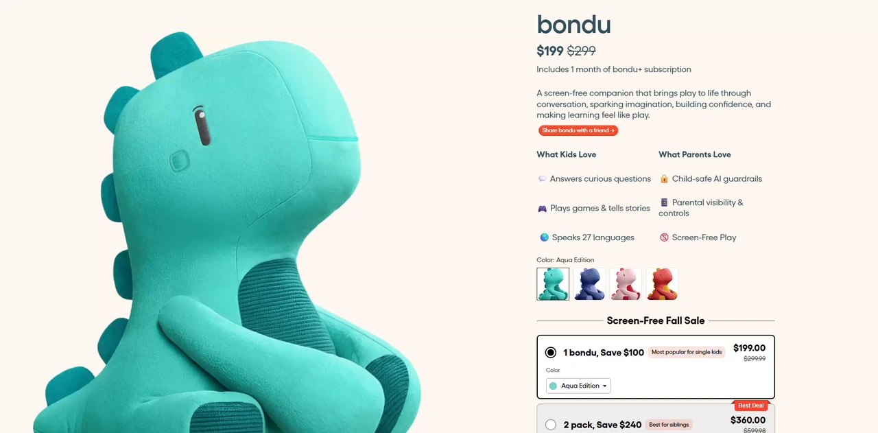
After introducing the product and its trust information, the product detail page focuses on choosing a companion. I grouped imagery, price, benefits, color selection and the add-to-cart action so the offer and next step can be evaluated together.
The individual companion and two-pack are presented as comparable options, with original prices, savings and a ‘Best Deal’ marker. The bundle introduces an upselling opportunity while making its additional value explicit. The stated 60-day return promise and familiar payment options sit close to the purchase action to address practical purchase concerns.
Usage videos, family stories, parent-app information and FAQs provide more detail further down the page. The conversion hypothesis was that understanding the experience, comparing the offer and finding reassurance would support the decision to add bondu to the cart.
A playful identity with a clear structure
E-commerce redesign
I kept the product’s playful character through rounded forms, warm backgrounds and imagery of family life. Section colors distinguish themes such as personalized play and privacy, while repeated heading and card patterns provide a consistent structure for the information.
The balance was deliberate: expressive imagery introduces the experience, while clear headings and explanations carry the detailed product and trust story. The visual language creates continuity between playful discovery and the more considered purchase decision.
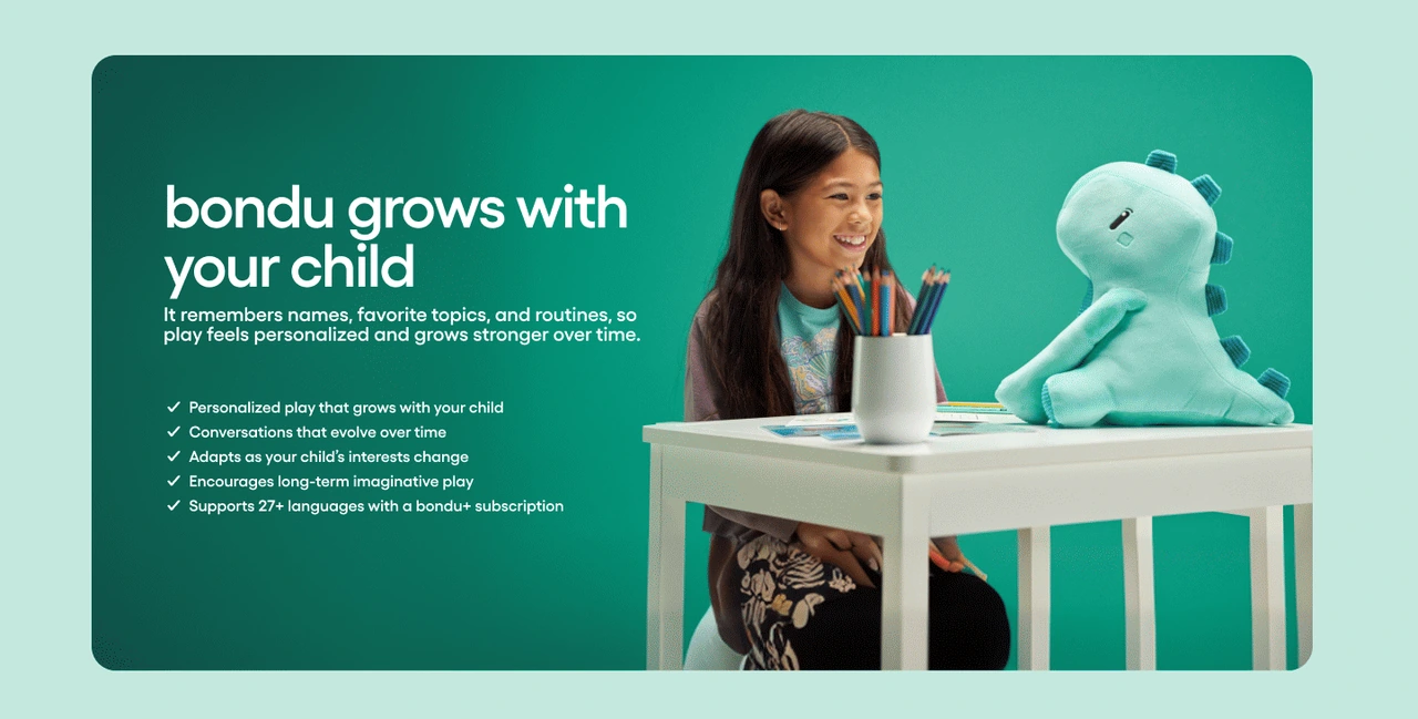
Mint and green give the theme of growing together its own place in the page.


Warm tones, family imagery and a consistent card structure connect safety and privacy with the visual identity.
Adapting the experience to mobile
E-commerce redesign
On the mobile homepage, the product image leads into the explanation and order action. In the Trust Center, the safety introduction sits above the image so the topic is established first. Each opening preserves its own purpose instead of following one fixed image-and-text order.
Side-by-side sections become stacked sequences. The parent-app features use a horizontal carousel with navigation controls, allowing individual explanations room on a narrow screen. This keeps the cards readable, with the trade-off that further features require interaction.


Complete final mobile homepage and Trust Center. Scroll within each preview to explore the original design from the opening to the end of the page.
The result
E-commerce redesign
The complete website redesign establishes a consistent visual language and information hierarchy across the e-commerce experience. The selected homepage, Trust Center and product detail screens show how product explanation, control and privacy information, and the purchase decision work together. These screens show my original design - the live shop has since been updated.
The central design balance is between playful discovery and an adult’s need for specific information. Trust is part of the product explanation, with details parents can inspect throughout the journey. The resulting design brings the brand’s playful character and the parent’s need for clarity into one coherent website.