
Duryn
Make the product desirable. Make the purchase clear.
Duryn creates water filtration products with a focus on premium materials and everyday use. I redesigned the shop to bring that quality into the digital experience and connect product discovery, understanding and purchase in one coherent journey.
- My contribution
- Shop concept, information hierarchy, visual direction and UI/UX design.
- Project scope
- Shop redesign across desktop and mobile. Homepage, PDP and cart show key decisions within the wider experience.
These screens document my redesign. Current shop content and purchase options may differ.

The challenge: connect premium appeal with purchase clarity
Premium e-commerce and UI/UX
A considered purchase needs both desire and understanding. The shop had to communicate why the product belongs in a premium home while helping visitors understand filtration, materials, cartridge choices and ongoing use.
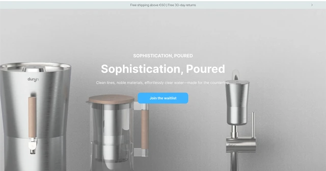
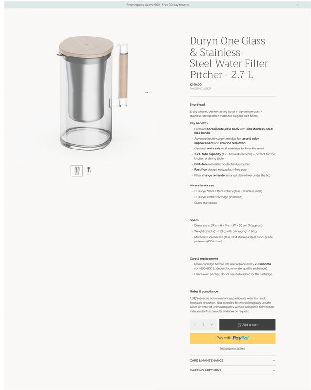
The previous homepage opened with a broad lifestyle statement and a waitlist action. On the previous product page, benefits, specifications and care information formed a long text column before the purchase controls. I reorganized the experience around the questions that lead to a decision: what makes the product valuable, which configuration fits, and how to buy it.
Show the value
Connect the product's materials and everyday setting with a clear reason to choose it.
Clarify the choice
Bring product options, purchase model and price into one readable decision area.
Keep the next step visible
Give purchase actions a clear role from the homepage through to the cart.
01 · Give the first impression a clear product promise
Premium e-commerce and UI/UX
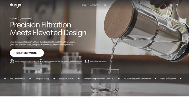
The redesigned homepage opens with the product in use and a direct proposition that connects filtration with elevated design. The headline, short explanation and Shop Duryn One action share one focal area. Product benefits and reassurance sit close to that entry point.
This changes the role of the opening: visitors can see the product, understand the offer and reach its purchase page from the same scene. The photography carries the premium tone, while the hierarchy gives that atmosphere a practical purpose.
Before
After
Build the product story from tangible evidence
Premium e-commerce and UI/UX
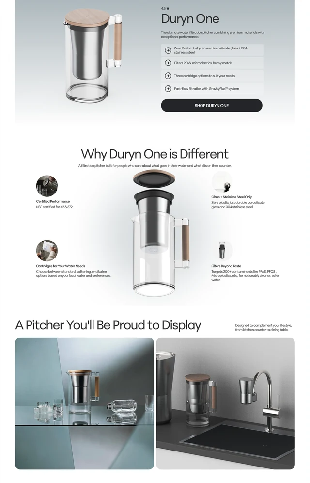
Below the hero, a dedicated product card pairs a large isolated view with concise benefits and another route to the PDP. An exploded product view then connects individual components with their purpose. This progression moves from the overall promise into how the product is built.
Kitchen and table imagery show the pitcher in its intended setting. Technical explanations, customer content and FAQs add different layers of context as the page progresses. A restrained palette, consistent spacing and focused image compositions make room for the glass, steel and wood to carry the visual character.
02 · Bring the buying decision into one place
Premium e-commerce and UI/UX
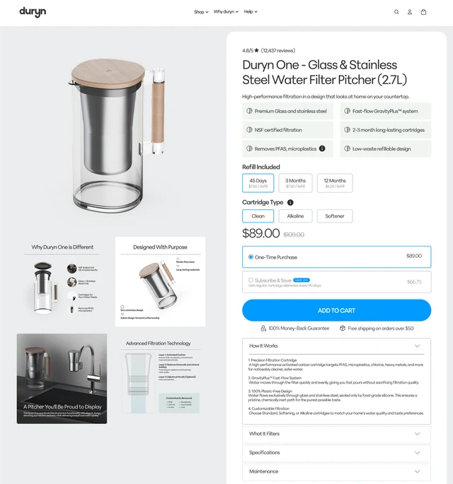
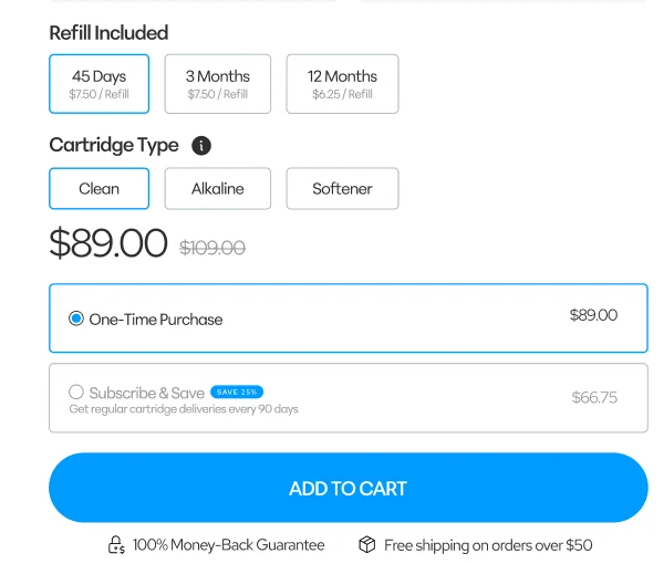
The previous PDP placed the Add to cart action beneath several blocks of technical copy. The redesign groups the product title, short benefits, refill choices, cartridge type, price and purchase model in a dedicated purchase panel beside the gallery. Visitors can compare the relevant options without working through all the supporting content first.
One-time purchase and subscription appear as distinct choices, with their prices beside them. A prominent blue Add to cart action anchors the panel. Detailed filtration, specifications and maintenance move into clearly labelled accordion sections, keeping the information available without giving every detail equal weight.
The Save 25% badge on Subscribe & Save and the price reduction from $109 to $89 make the financial benefit immediately visible. Trust cues such as 100% Money Back Guarantee and Free Shipping on orders over $50 sit close to the purchase action. I placed these elements deliberately to reduce hesitation, strengthen the buying decision and support conversion rate optimization (CRO).
Before
After
03 · Let the cart confirm the choice and lead forward
Premium e-commerce and UI/UX
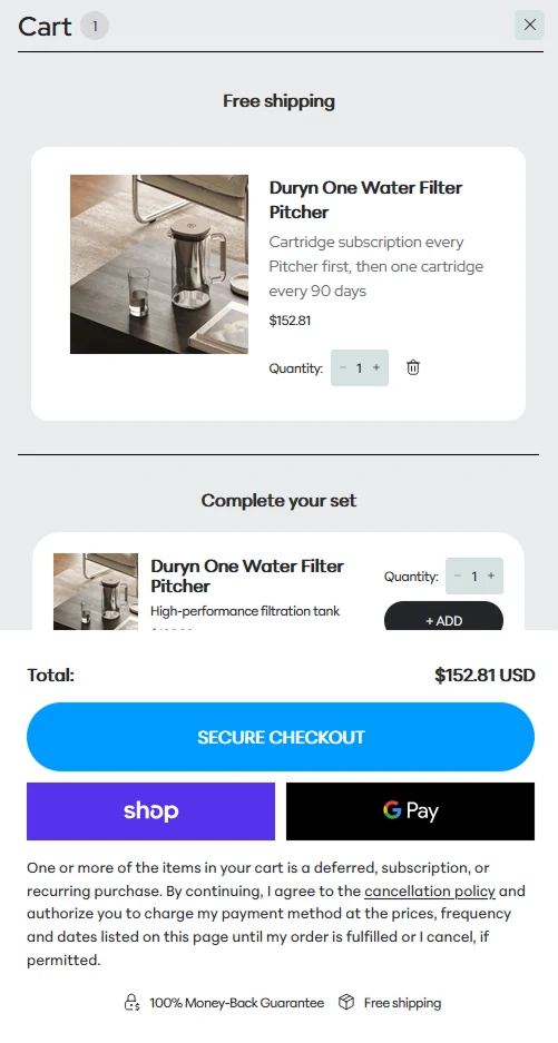
The cart presents the chosen item with its image, purchase details and quantity controls before the checkout area. The subscription description keeps the recurring cartridge schedule visible within the order summary.
The total and Secure checkout action form the primary next step. Express payment options offer alternative routes, while shipping and guarantee cues provide reassurance near the action.
I designed Complete your set as a targeted upselling measure: complementary products give customers a reason to expand their order, with the aim of increasing average order value (AOV). The recommendations remain secondary to the selected order and checkout, so the purchase can continue without distraction.
Mobile first, responsive across all devices
Premium e-commerce and UI/UX
I take a mobile-first approach because mobile devices account for the majority of web browsing today. I prioritize the mobile experience and adapt all content responsively for smartphones, tablets and desktops. Explore the two scrollable mobile designs below.
Mobile homepage

Mobile product page

Explore the complete designs
Premium e-commerce and UI/UX
View the final homepage and product page in their full sequence, or switch to the original designs for comparison. Scroll inside each design to explore the layout and supporting details.

The result: a premium shop with a clear route to purchase
Premium e-commerce and UI/UX
The redesign connects the product's visual appeal with a structured shopping experience. The homepage establishes the offer, the PDP organizes the purchase decision, and the cart confirms the order and leads into checkout.
Clear purchase options, visible savings, trust cues and a focused checkout contribute to conversion rate optimization (CRO). Together with targeted upselling in the cart, these design decisions aim to reduce purchase friction, support conversion and increase average order value (AOV).