
Upmetrics
Making a versatile offering clear.
Upmetrics brings business planning, financial forecasting, pitch decks and strategic planning into one platform. I designed the entire website to make this broad offering understandable and guide different visitors towards the right starting point.
- My contribution
- Design system, information architecture, visual direction and UI/UX design.
- Project scope
- Design of the entire website, including the homepage, product and solution pages, services, supporting content, pricing and sign-up.
The screens below highlight key decisions across the website.
The Challenge
Upmetrics brings several planning tools, professional services and use cases together. A first-time founder needs a different explanation from a consultant managing multiple clients. The website had to make this breadth understandable without making every page compete for attention.
The central challenge was to connect product understanding, plan selection and sign-up, while giving each audience a relevant route into the offering.
Objectives & Goals
I focused the website around three priorities. Each one connects a communication goal with a concrete decision visitors need to make.
Clarify the offering
Introduce the platform, then give each capability room for a focused explanation.
Support plan selection
Keep use cases, billing and included capabilities easy to compare.
Distinguish expert services
Make it clear when visitors can plan themselves and when they can request professional support.
The Solution
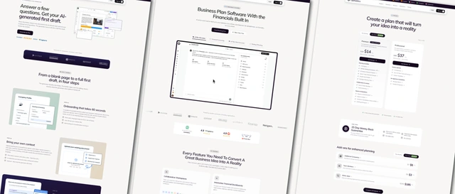
A connected website with a shared visual language and distinct page purposes. The homepage introduces the platform, product pages explain capabilities, solution pages address specific tasks, and services lead to a quote request.
Clear plan descriptions, separate add-ons and a focused sign-up experience carry that structure through to the next action.
Key Improvements
The redesign makes the offering easier to scan and gives product exploration, plan comparison and expert services their own clear priorities.
Make the product tangible
A direct value proposition and a prominent product preview introduce the platform before its individual capabilities.
Make plans easier to evaluate
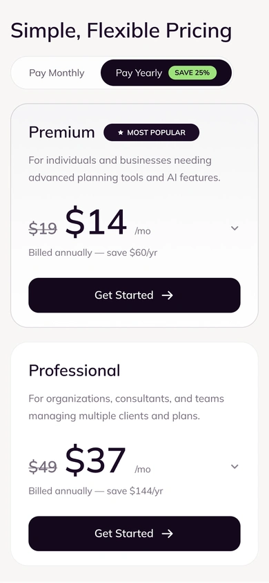
Plan purpose, billing and included capabilities stay together. Detailed comparisons and optional add-ons have their own space.
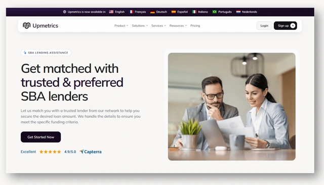
Give expert services a clear entry point
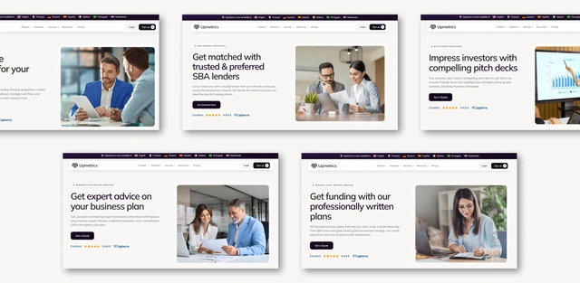
Service pages use focused messaging, photography and a quote request to distinguish professional support from the planning software.
Design Process
The following structure studies and design details explain the choices behind the website: how its pages connect, which content takes priority, and how recurring patterns work across different screens.
Sitemap overview
User Flow
Visitors can explore the product, watch a tour, compare plans or go straight to sign-up. The flow shows these available routes. It does not prescribe a single sequence.
Wireframes & layout exploration
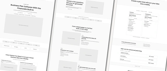
I used wireframes to work out the page layouts, content hierarchy and placement of key actions before moving into high-fidelity design.
Design decisions & rationale
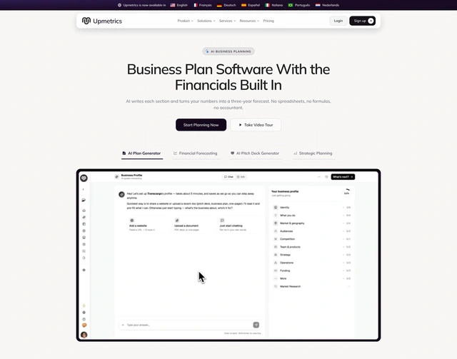
Explain the platform before listing its features
- Design challenge
- A broad feature list can leave visitors without a clear picture of what the product actually does.
- Design response
- I led with an outcome-focused headline and a large product view. Focused tabs introduce the capabilities, while direct sign-up and a video tour support different levels of readiness.
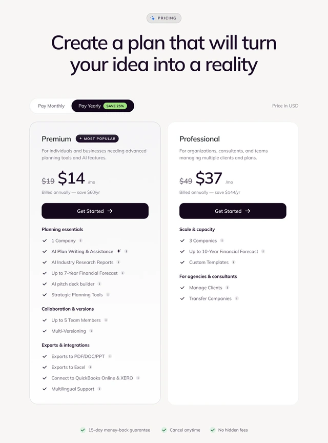
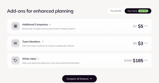
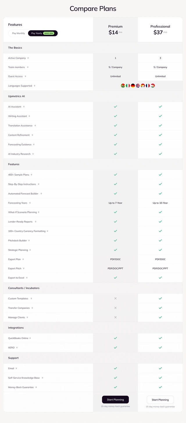
Separate the plan decision from the detail
- Design challenge
- Plan features, billing conditions and optional extras need to be available without overwhelming the initial choice.
- Design response
- Premium and Professional first explain who they serve. Price, billing and the action remain together. Feature groups, the comparison and add-ons provide progressively more detail.
Give expert services their own entry point
- Design challenge
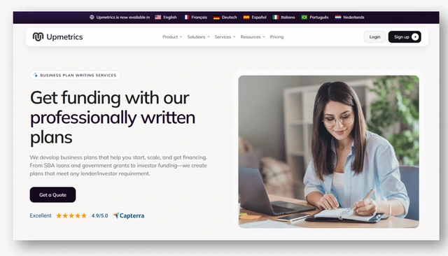
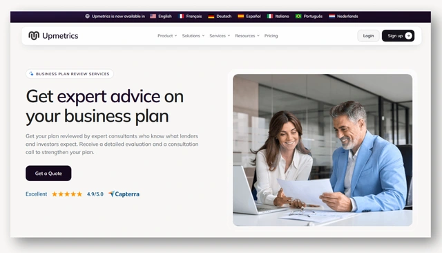
- The website offers both planning software and professional services. Visitors need to understand whether they are starting a plan themselves or requesting work from an expert.
- Design response
- I gave service pages a distinct presentation: service-specific messaging, photography and a quote request. Product pages use interface previews and actions that lead into the software, making the two paths easier to distinguish.
Design System
The design system defines color, Mulish typography, spacing and layouts. Reusable icons, buttons, form fields, cards, pricing components, navigation and the support widget create a consistent interface.
Final Designs
Explore the complete homepage, a product page and pricing using the tabs below. The AI Business Plan Generator is shown as an example of the website’s product pages.

A shared foundation across the website
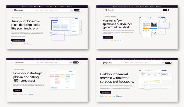
Product pages
A shared hierarchy of value proposition, product preview, primary action and trust cues, adapted to each capability.
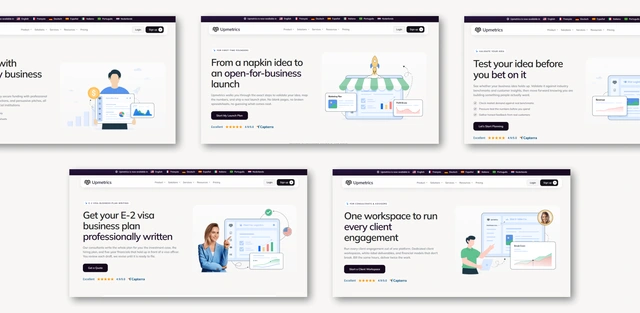
Solution pages
The same platform explained through different tasks, from funding a business to supporting clients or teaching planning.
Service pages
A distinct route to professional support, using photography and a quote request as the main entry action.
Responsive Design
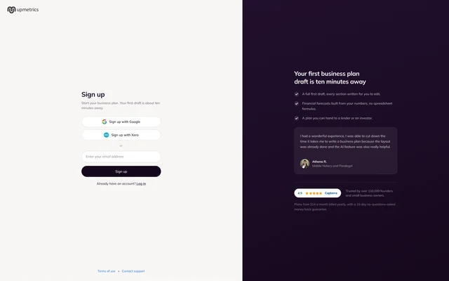
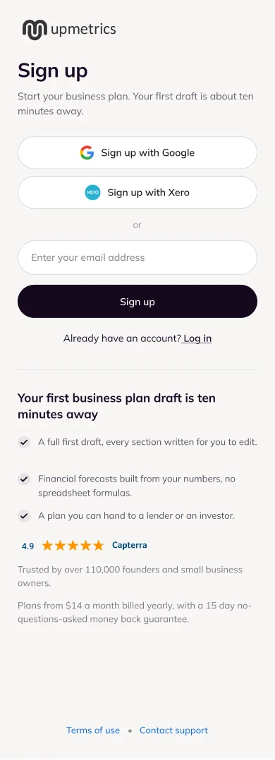
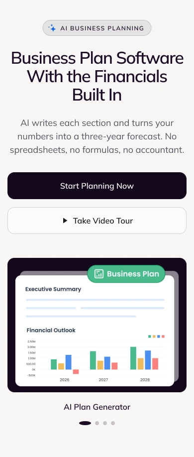
I designed the entire website with a mobile-first approach. Mobile browsing shaped the content hierarchy, navigation and primary actions from the start. These priorities carry through to tablet and desktop layouts, creating a consistent experience across screen sizes.


Impact & Results
The delivered website brings product communication, audience-specific content, professional services, pricing and sign-up into one coherent experience. A shared design system supports consistent patterns across the different page families.
A connected website structure
Product and solution pages explain the planning software and how it supports different business needs. Service pages present professional support for business plans, financial forecasts and pitch decks, with a clear route to requesting a quote.
A reusable interface system
Documented foundations, components and responsive patterns support consistency across page families.
A focused path to getting started
Product exploration, plan comparison and sign-up each have a clear role and next action.