
WAM! Mints
Keeping the personality. Bringing the product and purchase into focus.
WAM! Mints combines an expressive identity with a product positioned around everyday voice-related moments. I redesigned the complete shop and created social media and marketing assets to introduce the mints, explain their distinguishing features and support a consistent brand experience. This case study brings together the homepage, product page, three Instagram Stories, a product email for desktop and mobile, and two paid ad formats.
- My contribution
- E-commerce redesign, visual design, social media, email marketing and paid ads.
- Project Scope
- Complete shop design across desktop and mobile, with Instagram Stories, email marketing and paid ads extending the brand beyond the storefront.
- Status
- Live shop.
These screens document my redesign. Current shop content and purchase options may differ.

The task: translate a distinctive brand into a shop
E-commerce and brand communication
WAM! Mints already had a recognizable identity. My work covered the e-commerce redesign and supporting social and marketing assets. The central task was to carry the brand’s character into digital communication while helping visitors understand the product and move towards a purchase.
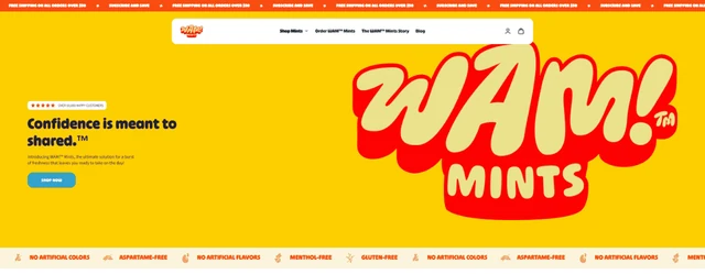
The original homepage gave a large share of the opening to the logo, with a smaller introductory message. I shifted the emphasis towards product context and a scannable explanation, then carried that hierarchy into a focused purchase area on the product page.
Homepage: connect the first impression with product relevance
E-commerce and brand communication
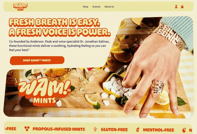
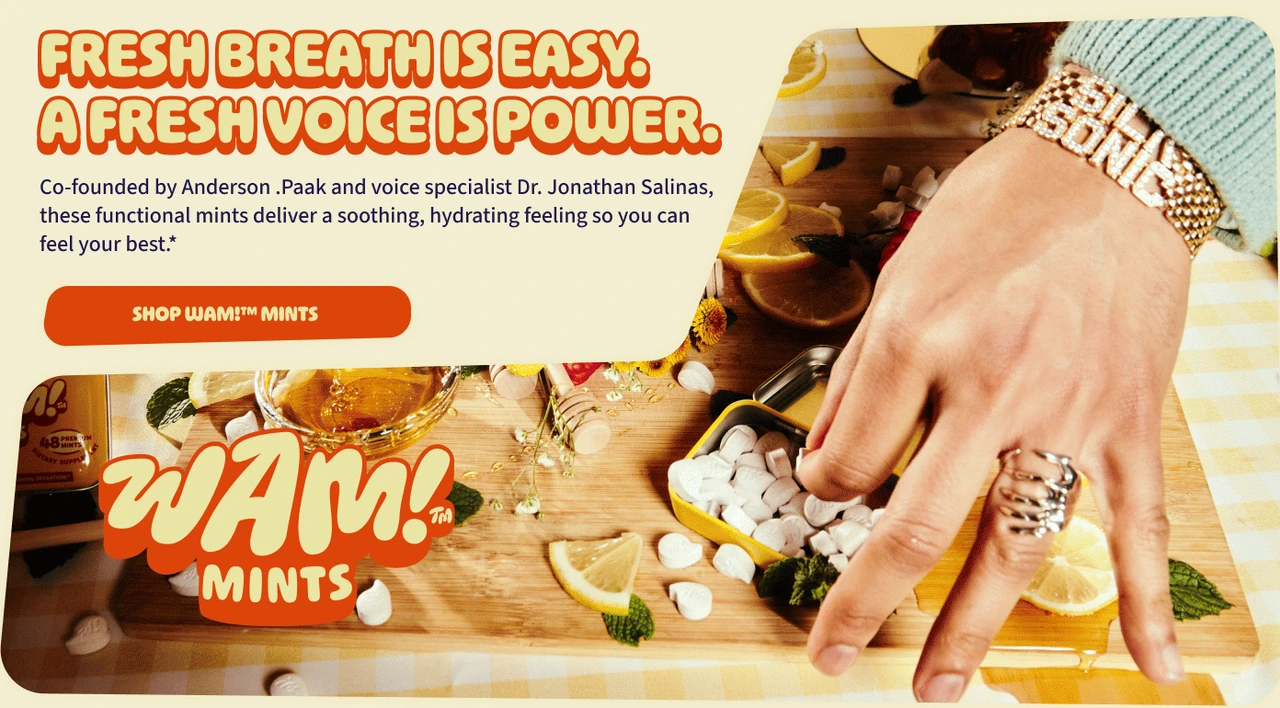
I brought the mints into the opening through contextual photography, a prominent introduction and a direct shop action. The product is shown in an everyday setting, giving the expressive brand an immediate connection to what visitors can buy.
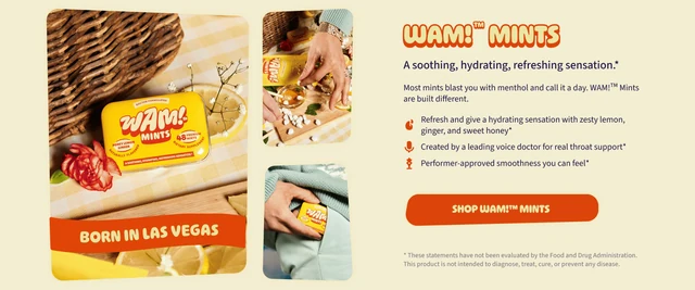
Below the opening, product features and usage occasions explain the brand’s proposition. The founders’ story then adds context to that positioning. The aim is a progression from understanding the offer to recognizing its relevance and choosing to explore the product.
Brand expression with distinct roles for information
E-commerce and brand communication
Cream and yellow surfaces, orange accents, rounded compositions and expressive headings preserve the existing identity’s character. The display typography carries short brand messages, while simpler text presents descriptions and practical shopping information.
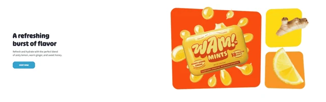
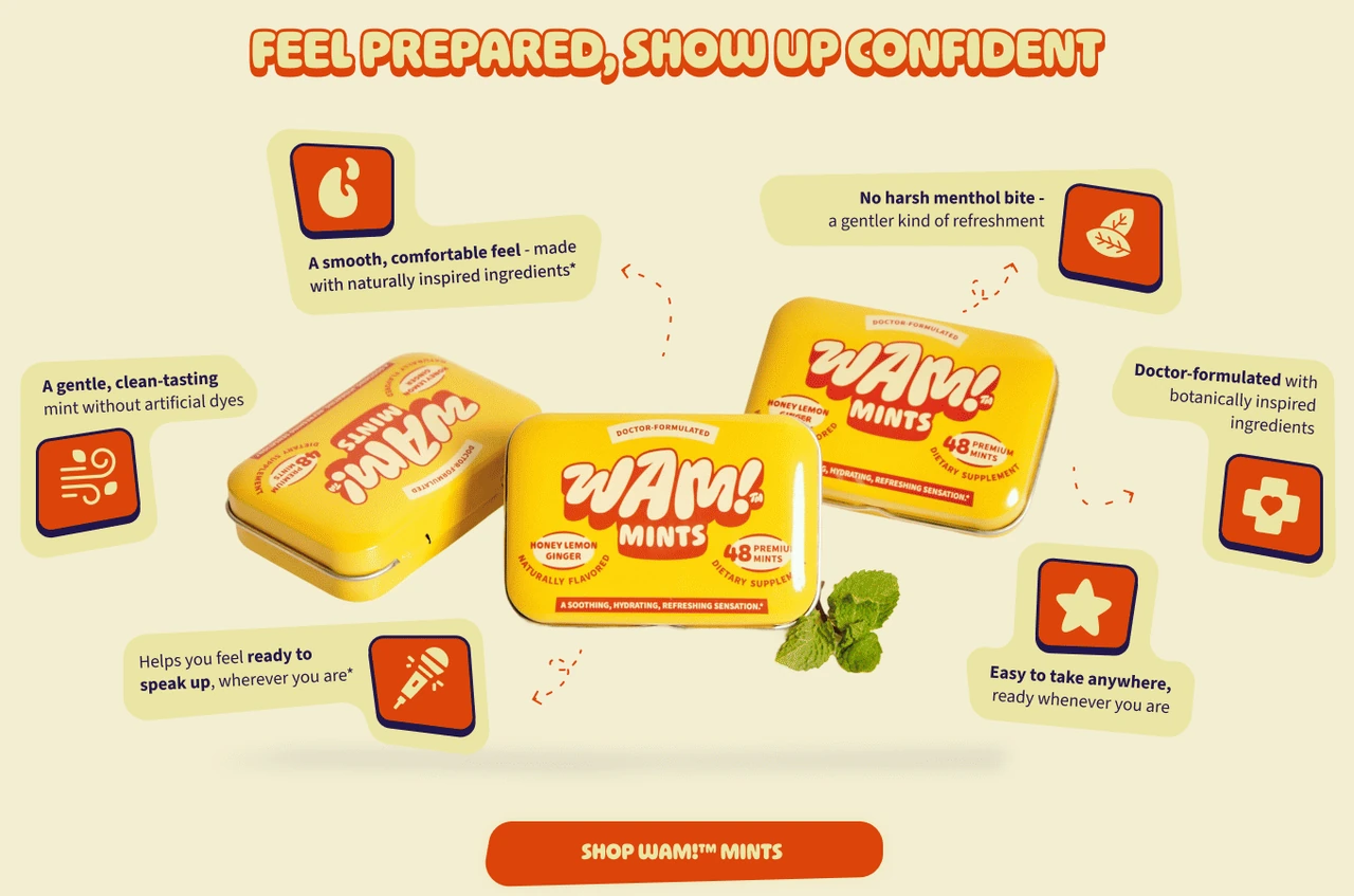
The feature overview combines product photography with illustrated callouts. It makes room for an expressive presentation, while the more detailed explanations elsewhere use a clearer reading sequence. The balance is between recognition and the amount of information each part of the page needs to communicate.

Product page: put selection and purchase in one decision area
E-commerce and brand communication
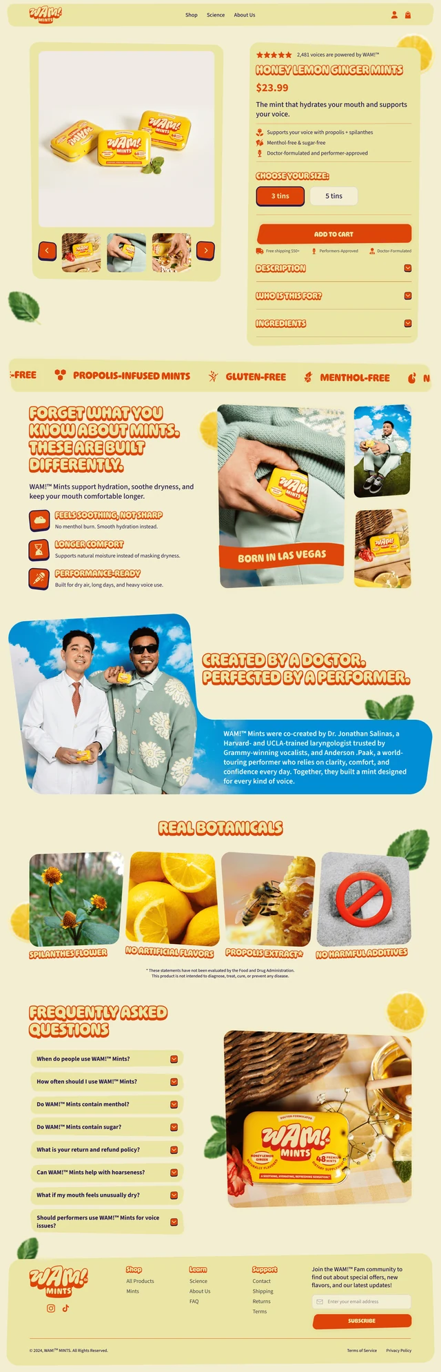
The gallery is paired with the product name, price and concise features. In the documented redesign, three- and five-tin choices sit beside a prominent add-to-cart action. This grouping brings the information needed for the immediate purchase step together.
The star rating builds trust at the start of the purchase area. Free Shipping $50+, Doctor Formulated and Performer-approved provide further reassurance beside the add-to-cart action, keeping purchase conditions and credibility visible at the point of decision.
Expandable descriptions, audience information and ingredients keep the purchase area compact. The sections further down the page reinforce the buying decision with more detail about the product, its ingredients and benefits.
Mobile first, responsive across all devices
E-commerce and brand communication
I take a mobile-first approach because mobile devices account for the majority of web browsing today. I prioritize the mobile experience and adapt all content responsively for smartphones, tablets and desktops.


Beyond the storefront: social, email & paid ads
E-commerce and brand communication
The brand extends across Instagram Stories, email marketing and paid ads. Cream and yellow surfaces, orange accents, expressive typography and original product photography connect the formats, while each composition gives the message a clear role.
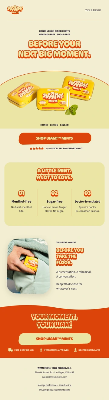
The three Stories focus on everyday relevance, product distinction and the founders’ story. The product email develops a longer sequence from introduction and features to a usage occasion and shop action, with layouts adapted for desktop and mobile.
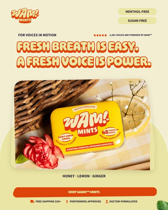
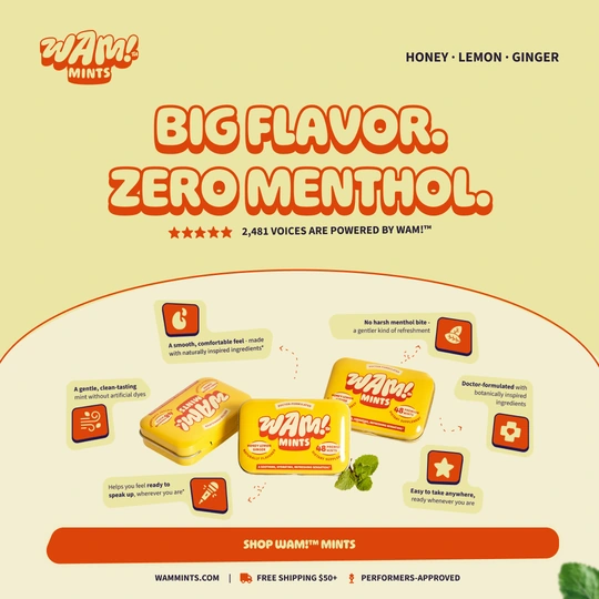
The two paid ad formats use different focal points. The portrait creative pairs a bold message with the tin in an everyday setting. The square product ad puts flavor, product features and the packaging at the center, supported by illustrated callouts and a clear shop action.
Instagram Stories
Three original Story designs, each with a distinct job: everyday relevance, product distinction and brand credibility.

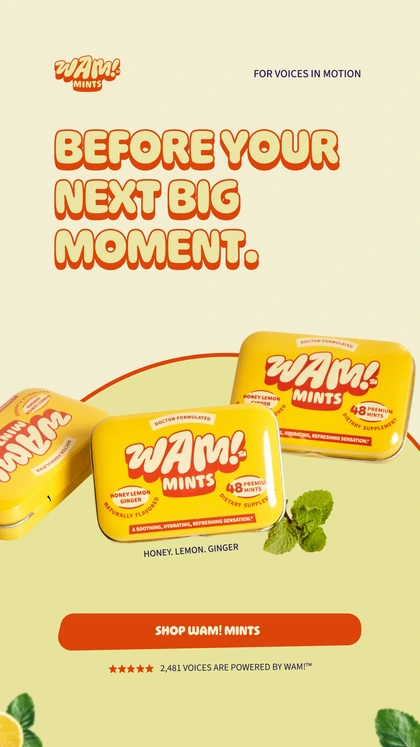
A usage-oriented headline leads into a prominent product composition and one shop action. The hierarchy connects the occasion with the offer.
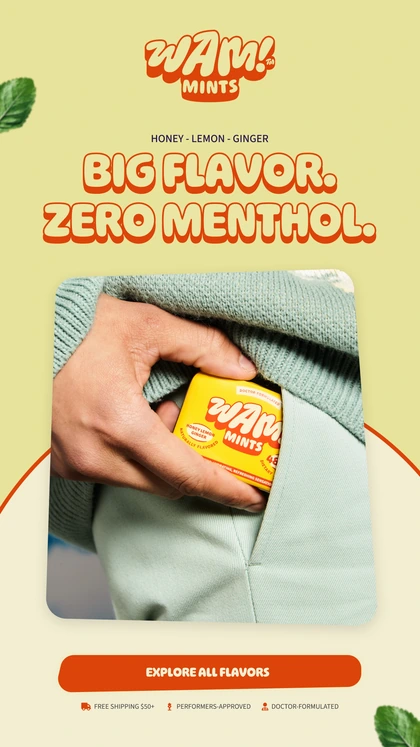
The product distinction leads the message. The photograph brings the compact tin into an everyday setting, with the action below as a clear next step.

The founders’ portrait pairs expertise with performance. The two short statements and the location banner give the brand story a distinct composition within the series.
Email marketing
One product story, adapted for desktop and mobile. The mailing connects an expressive opening with product features, an everyday occasion and clear shop actions.

Paid ads
Two paid social ads combining bold product messaging, clear benefits and direct shop actions.
The result
E-commerce and brand communication
The published shop redesign connects a product-focused introduction, an expressive brand story and a structured purchase area across desktop and mobile. The visual hierarchy guides visitors from understanding the offer to choosing a pack and adding it to the cart.
Instagram Stories, the product email and paid ads carry that visual language beyond the storefront. Together, the web and marketing designs demonstrate a consistent brand experience with clear roles for product information, purchase and storytelling.